Juice Box Design
Assignment
Juice Box Design
Tools Used
Illustrator
Year
2022
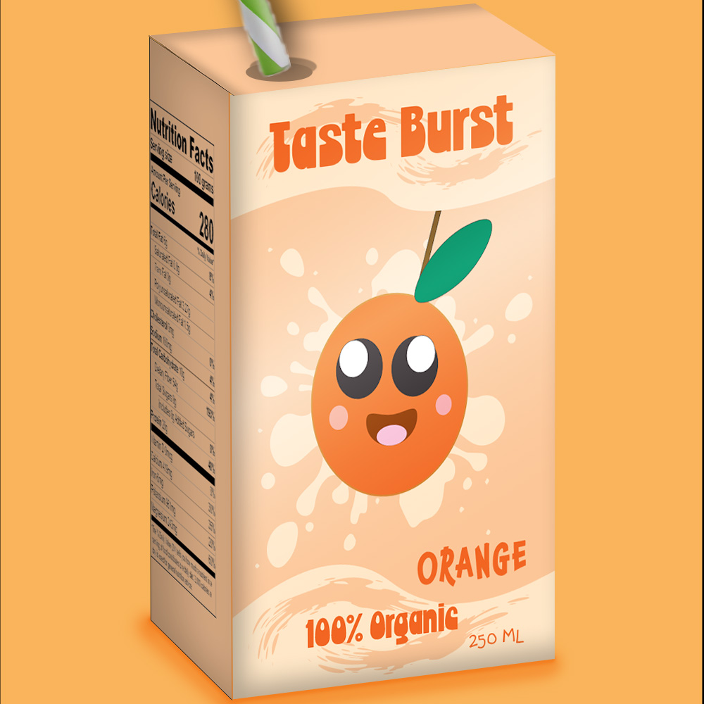
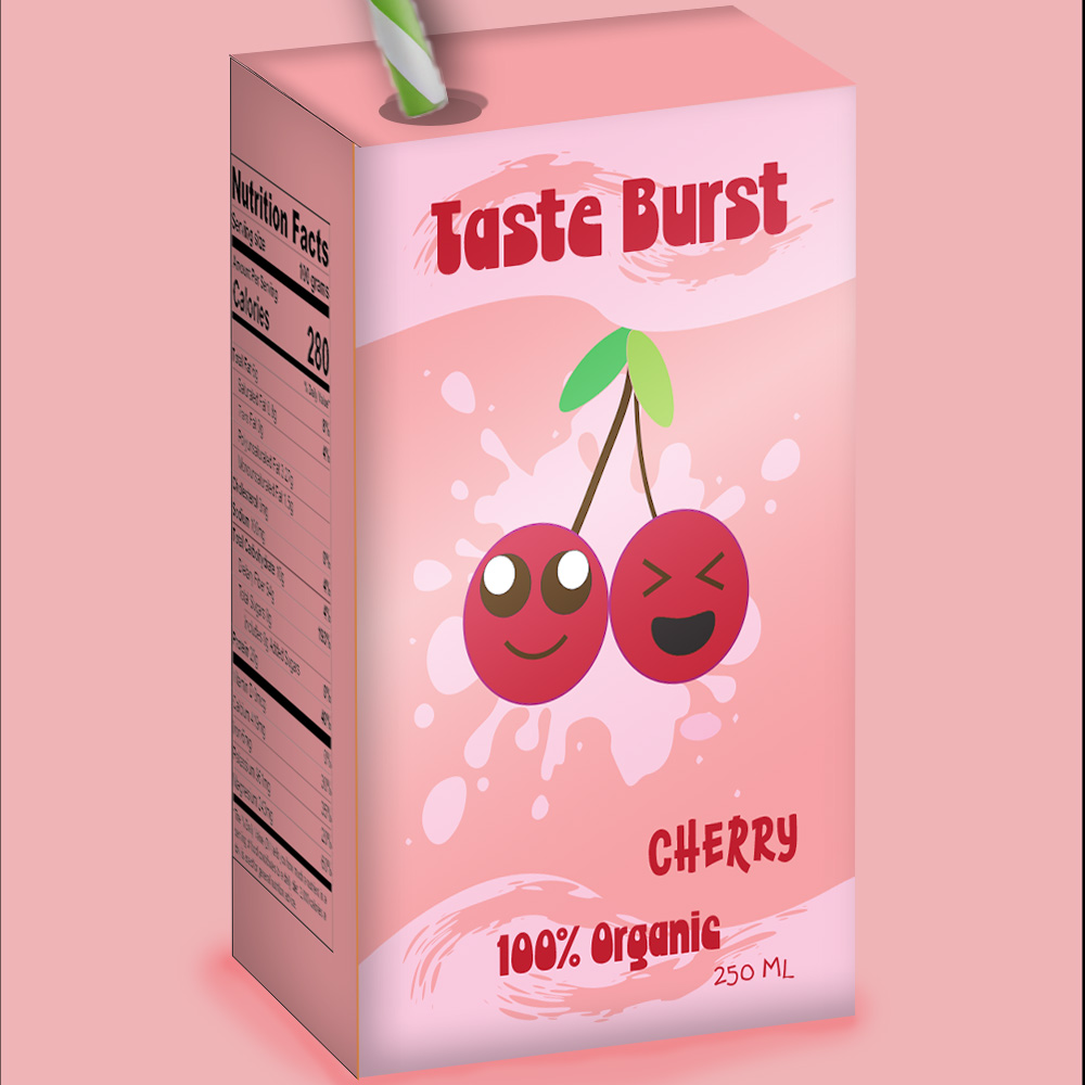
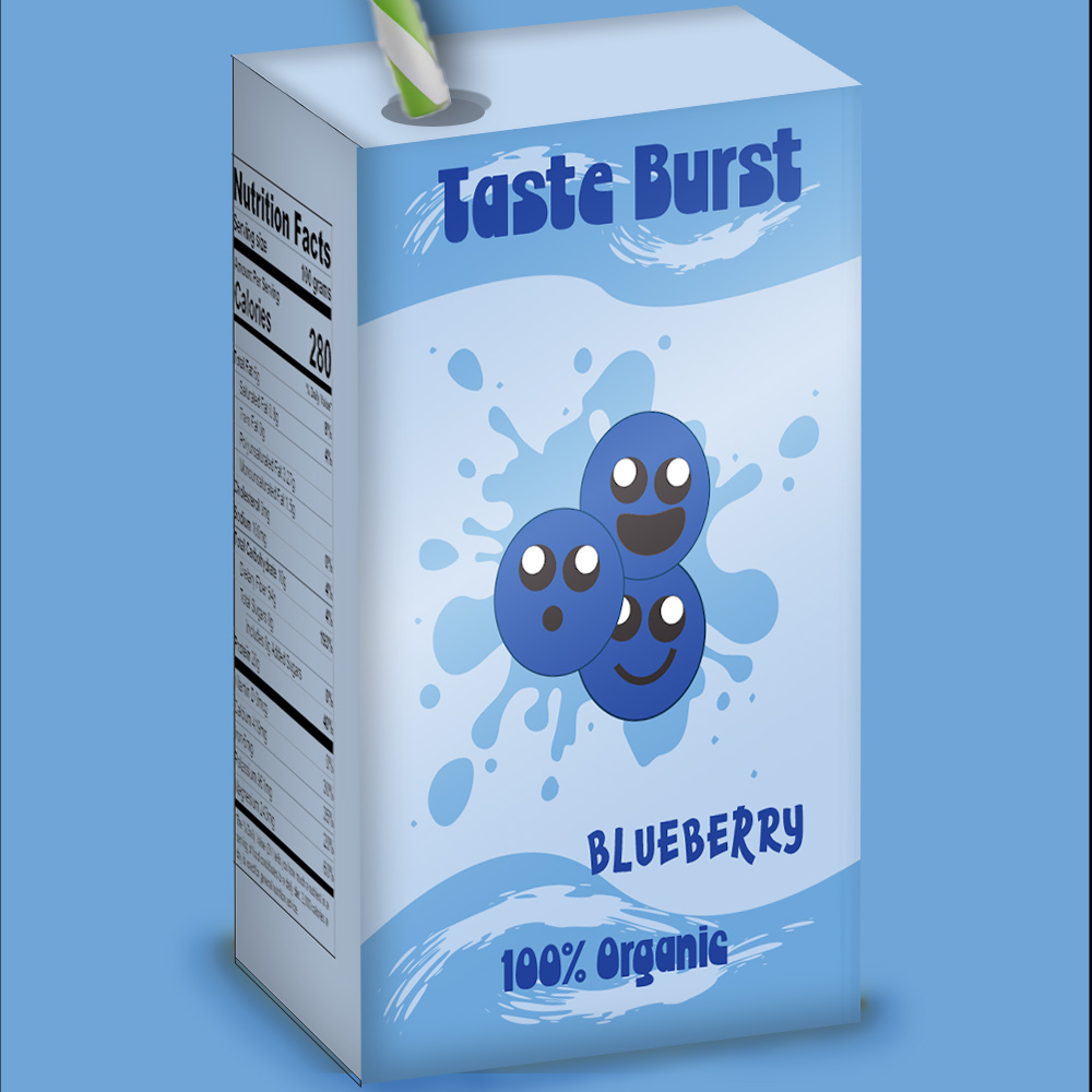
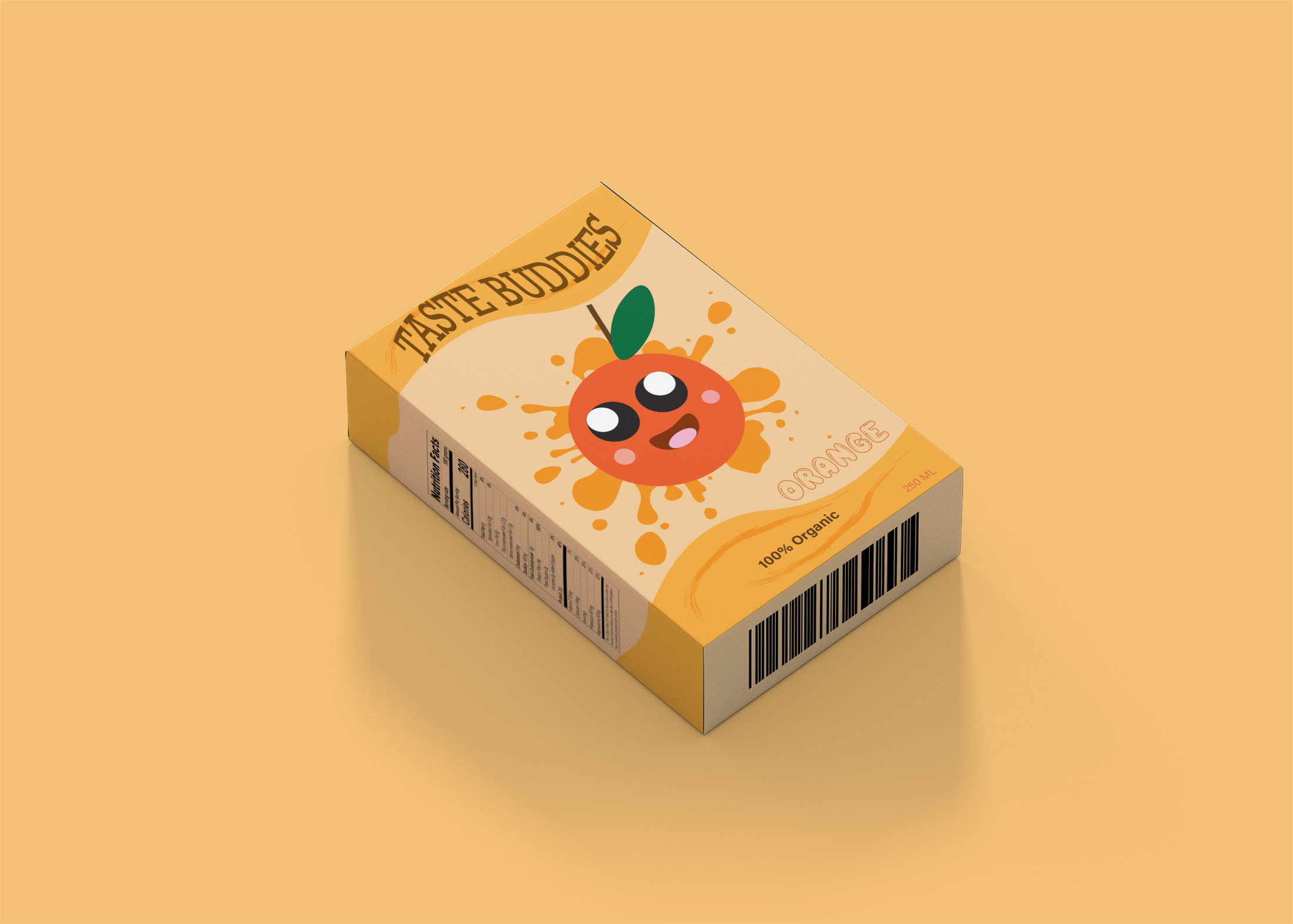
For this project, I decided to redesign the juice box packaging I initially did back in my first semester. The initial goal of the packaging was to create a fun packaging for an imagined company, the target audience being young children.
Feedback From My Peers:
-The company name seemed awkward.
-The placement of various design elements was not uniform through the 3 packaging.
-The elements were too close to the border, needed some space in between
-Not all the fruit characters had a stroke, either add the stroke for all the characters or have no stroke for all the characters.
-The "250ml" part needed to be more visible.
The Changes I Will Apply:
-I added a darker stroke for each character.
-I changed the company's name to something more fun and marketable.
-I made sure the placement of each element matched throughout the 3 packagings.
-I change the font for the company's name, the flavour profile, the "250ml" part and the "100% oragnic part".
-i made the "250ml" more visible.
-I changed the colour saturation for the orange juice package to match the more pastel colours of the other 2 packagings.
The Original
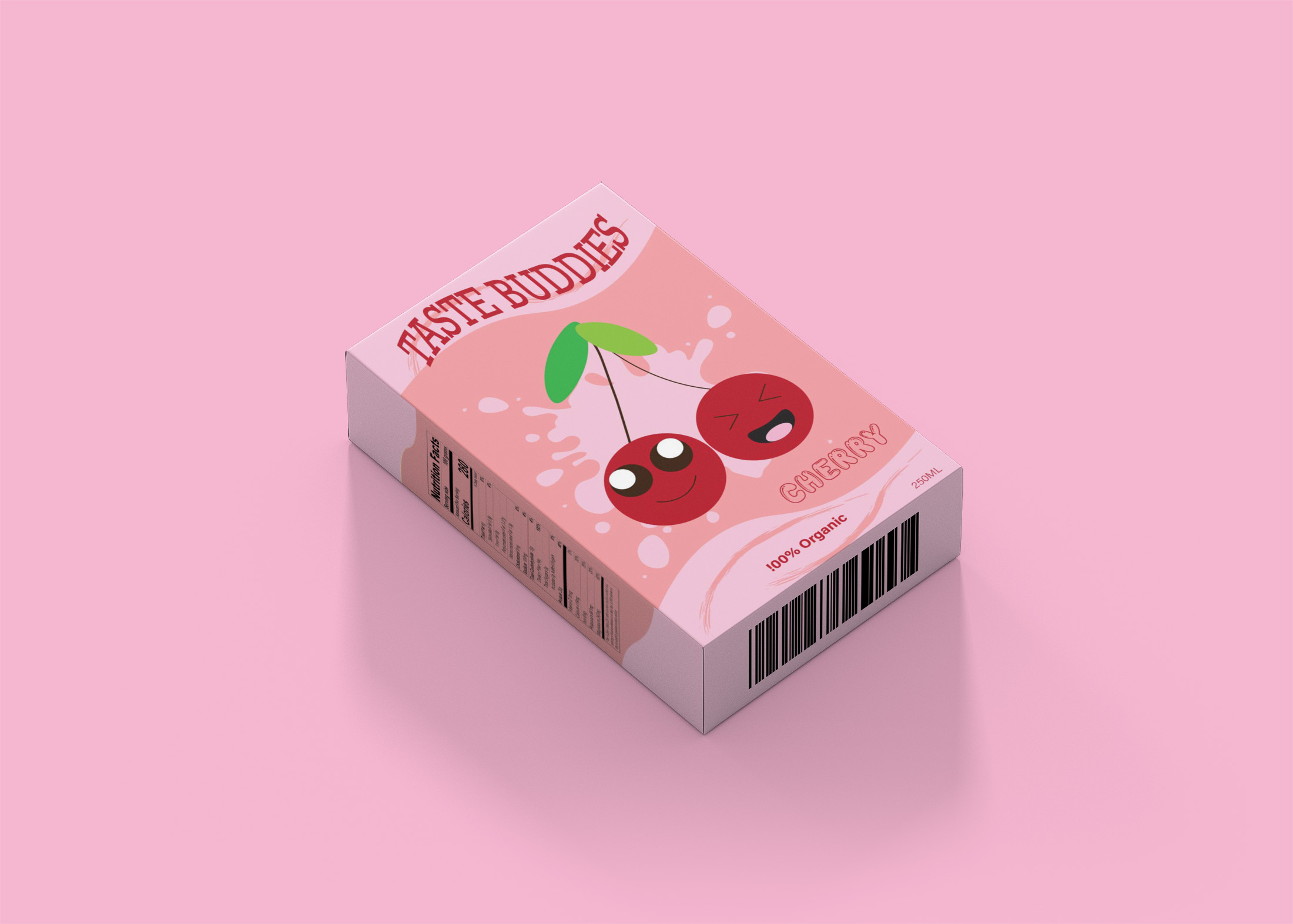
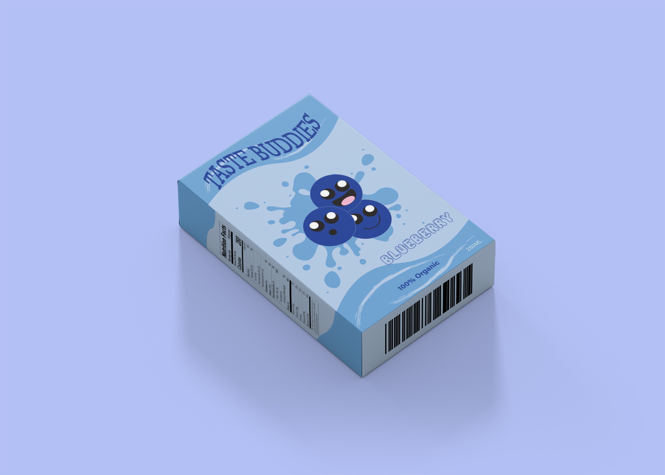
The Redesign